Maine Mariners logo and symbol, meaning, history, PNG
- Download PNG Maine Mariners Logo PNG The Alaska Aces have relocated to Portland, Maine to begin the 2018-19 season as the Maine Mariners.
- It was announced at the end of September in 2017.
- A month later the club revealed the logo and the color palette.
- Meaning and history 1995 – 1996 In 1995 the team, known today as The Maine Mariners, was called the Anchorage Aces hockey team.
- And the logo, designed in that year was all built around the logotype.
- As for the additional lettering, it was all executed in black and white and placed above and under the main inscription.
- 2003 – 2017 The name of the team was changed to the Alaska Aces in 2003, and this is also when the new logo saw the light.
- It was a modern and cool badge in a white, blue, and black color palette with small green elements on the top part.
- The logo featured an image of a polar bear with long sharp claws and fangs, placed on a black and blue background, which was repeating the shape of the hockey puck.
- Both parts were set on a black background and slightly diagonally oriented.
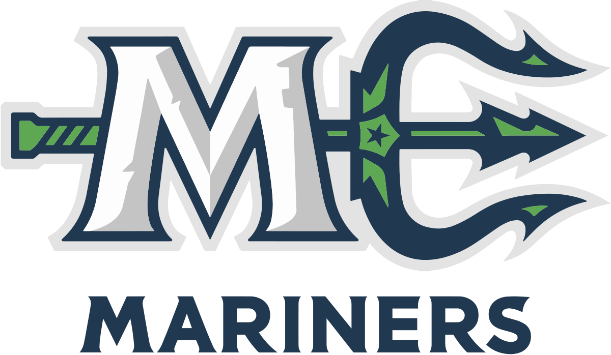
- At first sight it may seem that it consists of only the name of the team and two elements ‒ the letter “M” and Neptune’s trident.
- Actually, it is full of imagery and symbolism.
- All the elements are directly related to the state of Maine.
- The middle spear of the trident is stylized to look like a pine tree.


Leave a Review