Trenton Thunder logo and symbol, meaning, history, PNG
- They started competing in Glens Falls, New York, as the Glens Falls White Sox.
- They relocated to London, Ontario, in 1989, and then moved to Trenton, New Jersey, in 1994.
- Meaning and history Since 2003 when the Trenton Thunder became a Double-A affiliate of the New York Yankees, the team has changed its logo only once.
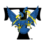
- 1994 — 2001 The very first logo for the Trenton Thunder club was introduced in 1994 and stayed with the team for seven years.
- It was a dark and ornate black and blue badge with the stylized smooth and enlarged black letter “T” as the background.
- On the letter, there was an image of a mythological bird with two heads.
- The creature was drawn in electric blue color with thin yellow accents.
- No additional lettering or framing was on the badge.
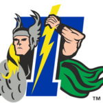
- 2002 — 2007 The character featured on the Trenton Thunder logo unveiled in 2003 was probably Zeus, the thunder god of ancient Greek religion.
- 2008 — Today The designers of the next version got rid of Zeus.
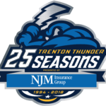
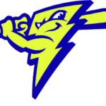
- Instead, they introduced an anthropomorphized blue cloud clenching a yellow lightning bolt like a baseball bat.
- The lettering “Trenton Thunder” was placed on the forefront.
- Colors The Trenton Thunder logo doesn’t seem to be visually aligned with that of its parent team, the New York Yankees, neither in its structural elements, nor in its colors.
- In addition to dark blue, the emblem of the Trenton Thunder also includes gold elements, white, light blue, and silver details.


Leave a Review