Rapid City Rush logo and symbol, meaning, history, PNG
- Download PNG Rapid City Rush Logo PNG The Rapid City Rush play professional hockey for Rapid City, South Dakota.
- Meaning and history 2008 — 2014 The Rapid City Rush logo looks as if the franchise didn’t put much effort into designing it.
- It features only one element ‒ a stylized “rushing” letter “R” in red color outlined in white, gold and black.
- 2014 — Today The team have kept their primary logo unchanged since it was unveiled in 2008.
- Alternate Logos Besides the primary logo they have two alternate logos which incorporate more details.
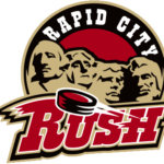
- One of them features the four presidential busts in gold against a red circle with a black outlining and “Rapid City” written in white on the top.
- At the bottom there is the team name with the same stylized letter “R” and a soaring puck.
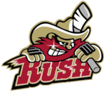
- The latter is the team name against the background of a grinning red-beard cowboy holding a bandaged hockey stick on his shoulder.




Leave a Review