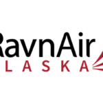
Ravn Alaska (before 2014 – Era Alaska) Logo
- Download PNG Ravn Alaska Logo PNG When Era Alaska changed its name to Air Alaska in 2014, it also adopted a new logotype.
- Meaning and history Before 2014 The old Ravn Alaska logo was dominated by the word “Ravn” in black.
- The capitalized word “Alaska” below was given in red.
- It was smaller and lighter.
- To the right, a red emblem could be seen.
- It was made up of three shapes that could be described as feathers or swooshes.
- Due to this, it is now better legible.
- On the current website (as of March 2020), the logo is white on the dark blue background.
- Font While both the lines of the Ravn Air Alaska logo feature a clean sans serif type, the upper line appears a little more elegant in comparison with the austere second line.
- Company overview Corvus Airlines is a regional airline focusing on serving the small communities in Alaska.
- The airline is based in Anchorage, while its main hub is Ted Stevens Anchorage International Airport.
- The fleet size reaches 12, while the number of destinations is around 30.
- The number of employees exceeds 900.
- In 2009, following mergers, the company adopted the name Era Alaska, while the name Ravn Alaska was adopted in 2014.




Leave a Review