Memphis Grizzlies logo and symbol, meaning, history, PNG
- It started to play in Memphis, Tennessee, where it received its current name.
- Throughout this period, the Memphis Grizzlies logo was almost identical, except for a minor change of the wordmark, which reflected the team’s new name.
- 1995 — 2001 The original logo featured a highly aggressive bear clenching a basketball in his paw.
- The bear’s teeth and claws were emphasized.
- 2001 — 2004 When the club moved to the US, it only changed one word in its logo.
- “Vancouver” was replaced by “Memphis” in red, while the 3D teal lettering “Grizzlies” from the Memphis Grizzlies old logo remained untouched.
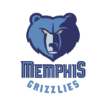
- 2004 — 2018 The current logo sports a less realistic bear’s head with yellow eyes.
- The logo is much easier to reproduce now.
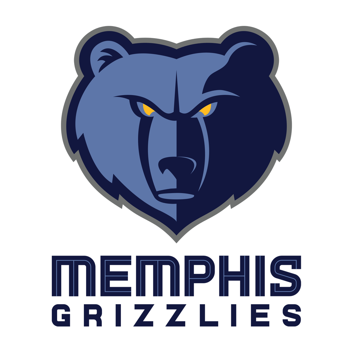
- 2018 — Today The redesign of 2018 strengthened the previous version of the Grizzlies logo, making the emblem a bit darker and the lettering — straight and solid.
- Now both parts of the inscription were set under the grizzly image in two lines, using a dark blue color for its bodies.
- The custom typeface of the upper part of the logotype has smooth angles, while the lower level is all strictly geometric, with sharp corners.
- What makes the glyphs particularly memorable is the unusual sharp elements.
- Color The official logo usage guidelines mention the following colors as the team’s primary palette: Grizzlies Navy (PMS 289), Grizzlies Blue (PMS 652), Smoke Blue (PMS 650), and a gold shade of yellow (PMS 123).
- Memphis Grizzlies Colors BLUE PANTONE: PMS 652 C HEX COLOR: #5D76A9; RGB: (93, 118, 169) CMYK: (64, 38, 7, 2) NAVY PANTONE: PMS 289 C HEX COLOR: #12173F; RGB: (18, 23, 63) CMYK: (100, 84, 45, 50) YELLOW PANTONE: PMS 123 C HEX COLOR: #F5B112; RGB: (255, 187, 34) CMYK: (0, 23, 91, 0) GRAY PANTONE: PMS 424 C HEX COLOR: #707271; RGB: (112, 114, 113) CMYK: (30, 20, 19, 58)





Leave a Review