Albuquerque Isotopes logo and symbol, meaning, history, PNG
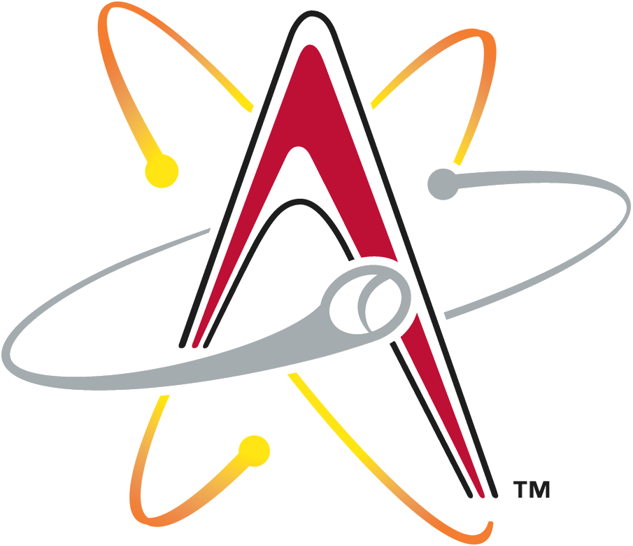
- Download PNG Albuquerque Isotopes Logo PNG The logo of the baseball team the Albuquerque Isotopes, which belongs to the Pacific Coast League, shows how a designer can give a “sporty” feel even to a chemical concept.
- Meaning and history The Albuquerque Isotopes, which are now the Triple-A affiliate of the Colorado Rockies, were founded in 1971 under the name of the Salt Lake City Gulls.
- The current name was adopted in 2003, following the club’s relocation to Albuquerque from Calgary.
- Symbol The Albuquerque Isotopes logo is a combination of the capital letter “A” (the initial of “Albuquerque”) and a stylized depiction of an atom, where neutrons move at an unbelievable speed.
- One of the neutrons is actually a baseball, which makes the logo more relevant.
- The logo is connected with the name of the team – isotopes are variants of the same chemical element with equal numbers of protons but a different number of neutrons.
- So, an isotope was depicted on the logo in the form of one of its atoms.
- Alternative emblems The club uses cap logos featuring the same shape but different colors schemes.


Leave a Review