New Orleans Pelicans logo and symbol, meaning, history, PNG
- Download PNG New Orleans Pelicans Logo PNG As a very young professional basketball team, the New Orleans Pelicans have had only one primary logo so far.
- During the first 12 years of its history, the team was called the New Orleans Hornets.
- It was only in 2014 that the club received its current name and the first logo was introduced.
- As the most prominent part of their logo New Orleans Pelicans used a stylized pelican.
- There’s the lettering “New Orleans” above, while the word “Pelicans” is placed below.
- 2002 — 2008 The very first badge for the club was created when its name was New Orleans Hornets, so the hornet was in the center of the composition.
- The insect was drawn in a funny caricature manner, in a sea-blue and bright blue color palette, and was placed between the two parts of the wordmark, set in the uppercase of a bold geometric Sans-serif typeface.
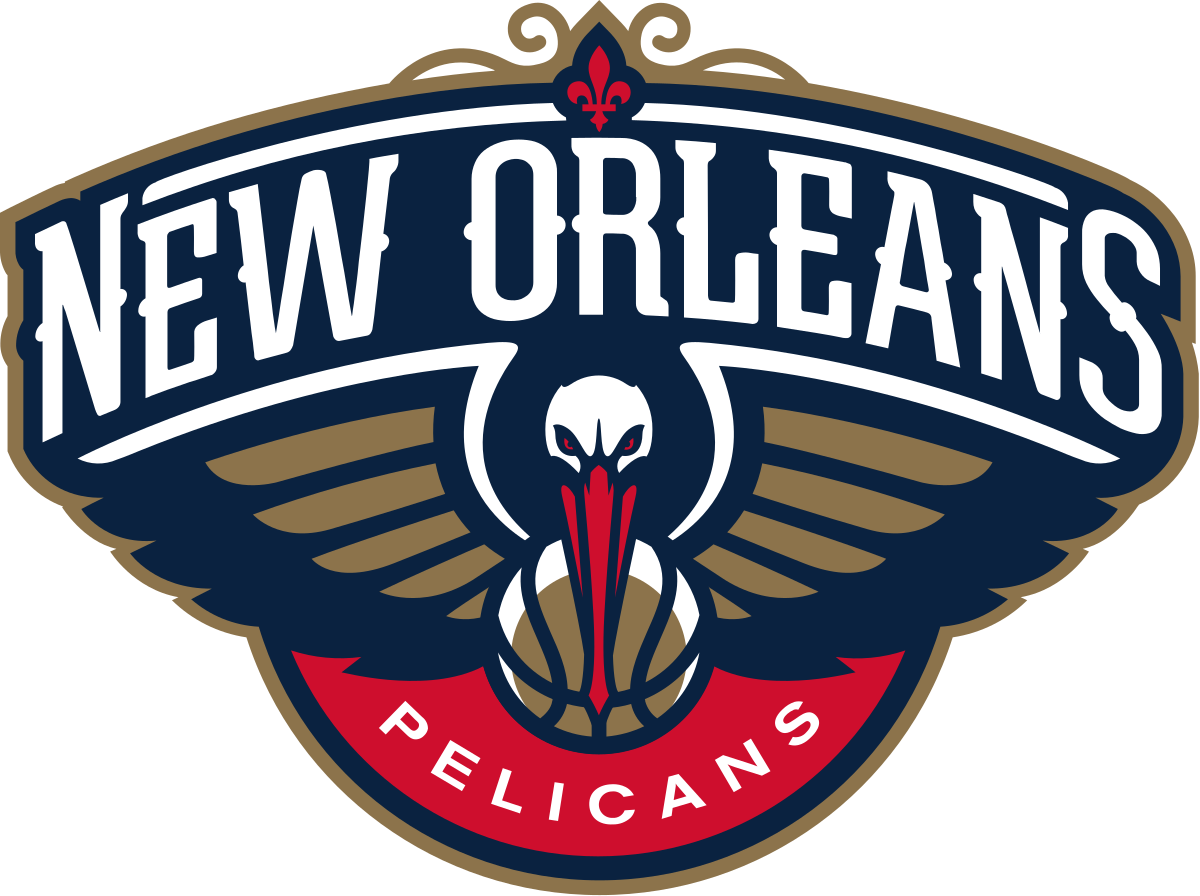
- The current Pelicans logo boasts a dark blue badge with a stylized gold and blue pelican holding a ball in his beak, a white arched lettering above it, and the red rounded element at the bottom, with the white “Pelicans” inscription, arched from the center.
- A gold (or brown) basketball can be seen under the bird’s red bill.
- Another logo sports a gold basketball, which is placed inside a red circle in such a way that a red crescent is formed above the basketball.
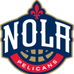
- Nola symbol One more logo features the white word “NOLA” (which refers to the city of New Orleans) in the same type as the one used on the primary logo.
- A red fleur-de-lis symbol can be seen above the lettering.
- By using the round elements, the author of the New Orleans Pelicans logo managed to create a symbolic link between the name of the team, the emblem, and the wordmark.
- Color The official palette includes navy blue (PMS 289), gold (PMS 872), which is actually more like brown, and a bright and eye-catching shade of red (PMS 186).





Leave a Review