Ronald McDonald House logo and symbol, meaning, history, PNG
- Download PNG Ronald McDonald House Logo PNG Ronald McDonald House is one of the most well-known non-profit organizations specialized in helping children all over the world.
- The Charity House was established in 1974 in the United States and today it operates worldwide, providing children in need with medical and health services.
- Meaning and history The visual identity of the Ronald McDonald House Charities was created in 1974 and has never been redesigned, as it brilliantly represents the purpose of the organization, being kind, friendly, and welcoming.
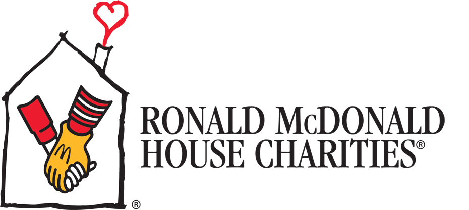
- The logo is composed of a big emblem in red and yellow, official McDonald’s’ colors, and a delicate wordmark under it.
- The Ronald McDonald House Charities logo is composed of a childish drawing of a house contour in black, with a red heart coming out of the chimney.
- In the middle of the emblem, there is an iconic symbol in red, yellow, black, and white — a man’s hand in a yellow glove with the letter “M” on it is holding a kid’s hand.
- This is a symbol of support, attention, and friendship, which looks touching and tender.
- The “Ronald McDonald House Charities” inscription in all capitals is placed right under the house and colored black in order to balance the whole logo.
- The wordmark is executed in a delicate and elegant serif typeface, which is very similar to Freight family fonts.
- The yellow and red color palette reflects love and warmth, while the monochrome details add a sense of authority and expertise to the organization’s activities.


Leave a Review