SpongeBob SquarePants logo and symbol, meaning, history, PNG
- Download PNG SpongeBob SquarePants Logo PNG SpongeBob SquarePants is an animated comedy TV series.
- Interestingly, the concept logo already played with the “sponge letters” approach.
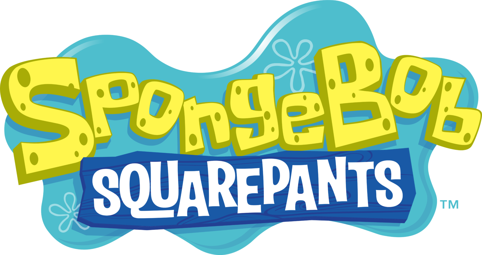
- All the glyphs forming the first word in the name of the series looked as if they were made out of sponge (like in the current SpongeBob SquarePants logo).
- 1997 The original version of the pilot episode featured a different emblem.
- The reason for this was that the “sponge” there was already introduced by the depiction of the cartoon character himself, so to repeat it in the lettering was unnecessary.
- The “sponge” design disappeared altogether.
- The “flower” from the old logo grew more prominent.
- This version has been nicknamed “The Colored DoodleBob.” 2016 It is basically the same logo, with a couple of updates.
- The colors have grown brighter, which is especially noticeable in the case of the fuchsia lettering.
- The shape of the glyphs has grown slightly more squarish to better fit the shape of SpongeBob.
- Also, the letters were capitalized.
- Merchandise logo This one is simpler than the main SpongeBob SquarePants logo.
- The character himself has disappeared.
- While the original version (introduced in 1999) featured flat letters, they were replaced by spongy ones in 2008.




Leave a Review