BCS Championship Game Logo
- Download PNG BCS Championship Game Logo PNG From 1998 to 2014, the national champion of the NCAA Division I Football Bowl Subdivision was determined during the BCS National Championship Game.
- After it was held for the last time in 2014, the College Football Playoff tournament was established for the same purpose.
- The symbolism of the cities where the tournament was held also affected the emblem.
- 2008 The very first logo for BCS Championship was created in 2007, and featured the Tostitos logo replacing the crown of the crest.
- It was a yellow and red crest with the solid black banner on the bottom part.
- The two-leveled lettering in white and yellow was set on the black background, underlined by a thin gray ribbon with the black “Arizona 2007” on it.
- The upper part of the logo featured a yellow and red ray pattern and a brown drawing of the mountains, where the bold white “BCS” abbreviation written over it.
- The upper part of the logo was now taken by the FedEx logo enclosed into a rectangular frame, placed above the white and orange sans-serif lettering, underlined by a stylized image of a rugby ball with the 2009 datemark on it.
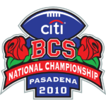
- 2010 The sponsor was changed to Citi Bank and the color palette — to blue and red in 2010.
- The two green palms were low replaced by two posh red roses, and the thin orange “South Florida” by bold white “Pasadena 2010”, set in two levels on a solid blue background under the arched red ribbon with the white narrowed “National Championship” written on it.
- The rugby ball moved to the top part of the crest, and the Citi logo was drawn over it in the corporate style and palette.
- 2011 The championship moved to Arizona again in 2011, and the Tostitos logo came back to the badge in the same year.
- Yellow was used for the bottom part of the crest, while it’s top part was now colored in carbon gray.
- The “BCS” abbreviation was enlarged and now was written in a bold square serif font, in calm red color with the thin white outline .there were no palms or roses on this badge, and the only additional element was set between the digits in the “2011” datemark — a stylized sun in red white and yellow.
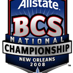
- 2012 For the 2012 season the championship moved to New Orleans, and the badge changed its color palette to blue and red.
- The new sponsor appeared, and it was Allstate, and its white logotype was written over the top part of the crest, above the red square with the gradient “BCS” inscription in extra-bold serif font.
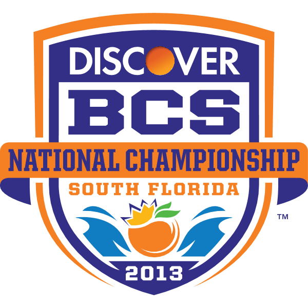
- The color palette turned white blue and tender orange, with the Discover logotype on top, and the orange image surrounded by blue waves at the bottom.
- The “South Florida” lettering in orange was placed right under the main wordmark banner, and the white “2013” datemark — under the graphics, at the very bottom of the crest.
- 2014 The elegant and mystical black and red badge was created for the National Championship in Pasadena in 2014.
- The datemark moved to the very top of the crest, and was now set in white above the Vizio logotype, executed in a fancy futuristic sans-serif, with gradient white-to-gray letters set on a plain black background.





Leave a Review