7Up logo and symbol, meaning, history, PNG
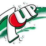
- Meaning and history The logo for the famous sweet drink has always been bright and evoked a bubbly and fresh sense, just like the brand’s product itself.
- The body of the emblem was colored red, white the up and bottom sides were thickened and painted in black.
- Seven white circles were placed around the inscription to represent the bubbles of the drink.
- Between the numeric and text parts of the brand’s name a large red dot in a white outline appeared.
- 1987 — 1993 The logo, introduced in 1987 featured a completely new color palette — the green inscription in a double blue and white outline and a solid red dot were placed on a white background.
- 2003 — 2007 In 2003 the white wordmark with a red dot gained a wide green shadow and outline, which added volume and motion to the brand’s visual identity.
- The logo was placed on a gradient green background with some black accents, which made it look stronger and more distinct.
- This logo stayed with the brand for only three years but is considered to be one of the most recognizable in 7UP history.
- Now the strict “7” with clean straight lines and cuts was colored white and placed on a background, composed of big green and a smaller yellow circle.
- Several white and green bubbles were drawn on the green part of the background.
- This logo is still used in some countries.
- 2015 — Today The redesign of 2015 brought smoother lines and a simpler color palette to the 7UP visual identity.
- The soft and elegant “7” in a distinct green outline is accompanied by a solid red circle with white “UP” on it.
- Numerous green and yellow bubbles are drawn on the right from the digit, on a white background.
- While preserving the 3D looks, this version gets rid of the whole wings-and-skateboard idea and adds some color.
- The letters (white with a black shade) are placed in a red box with two black lines.
- The 1972 version is pretty minimalistic in comparison with all the other ones.
- Font The type of the domestic 7up logo is simpler and more minimalistic without sacrificing recognizability.
- The “7” and “up” seem to have more in common than the same parts of the lettering in the international logotype.
- Video






Leave a Review