MGM logo and symbol, meaning, history, PNG
- It started with the merger of Samuel Goldwyn’s studio with Marcus Loew’s Metro Pictures and Louis B. Mayer’s company (1924).
- 1924 – 1964 The original Metro Goldwyn Myers logo was created in the middle of the 1920s and featured two independent parts, a logotype, which was used mainly for the official documentation, and an ornate emblem, which could be seen on the company’s products and posters.
- The logotype was written in two different typefaces, with the “Metro” and “Mayer” parts in an Art-deco style serif font, with the vertical bars of both letters “M” elongated, and the “Goldwyn” was set in elegant cursive with smooth shapes and curved tails.
- The second emblem for the company featured a circular badge with the lion’s head on it and the wide framing with the “Ars Gratia Artis” slogan.
- The bottom part of the emblem was decorated by several smooth ribbons, and the badge with the wordmark in a classic frame was placed under them.
- 1939 1964 – 1966 The logo from the 1960s featured a simplified version of the original emblem, depicting the lion’s head in a black circular frame and two black ribbons coming out of its bottom part to both sides.
- There was no wordmark on this version, and it made the badge look lighter and more balanced.
- 1966 – 1982 In 1966 the company adopted a modern style badge, where the lion in bold black and white lines was placed on a circle with no framing.
- The “MGM” wordmark was placed under the emblem, executed in a medium-weight sans-serif typeface with traditional shapes and cuts of the letters.
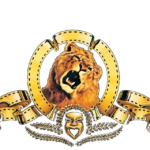
- 1982 – 1986 The logo, introduced in 1982, used the framing with ribbons from the original version, but the lion’s head was redrawn and now the animal had its mouth open, roaring.
- The enlarged wordmark in two levels was set under the emblem, with the “MGM/UA” in all capitals of the bold serif typeface, and the “Entertainment Co” placed under it, between two horizontal lines.
- The tagline was executed by a title-case of a simple and modest sans-serif font.
- 1984 – 1985 Another version of the 1980s had the same emblem, but the lettering was removed.
- Instead of the wordmark, there was one more ribbon under the rounded badge, where the “Entertainment Co” inscription was placed.
- The main nameplate was written around the lion’s frame perimeter.
- All the other features remained the same, including the framed lion and the style of the nameplate, though the “MGM” inscription got extended and gained a delicate outline.
- Another change of this year was in a black and white mask, placed under the lion’s portrait, between the ribbons.
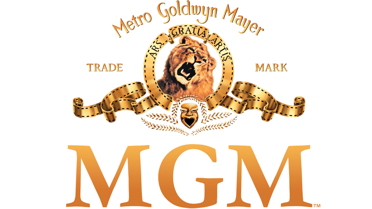
- 2011 – 2021 One more change was made to the Metro Goldwyn Mayer logo in 2011, it was the same composition, designed in 1992, but with the enlarged and bold black serif “MGM” inscription under its.
- Color The matte gold color of the elements that make up the MGM logo complements the natural color of the lion’s fur.
- Video





Leave a Review