evolution history and meaning, PNG
- The logo of the Polish apparel brand Cropp is a good example.
- Meaning and history The Cropp visual identity is based on the octagon shape.
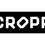
- Its logo is sharp, young and saucy, looking modern and strong in its simplicity.
- One more unique detail of the Cropp inscription is the diagonal placement of the letter “O”, which looks like it is falling out of the signboard.
- It is a perfect reflection of a hound rebellious spirit of the brand and the audience it is focused on.
- The Cropp logo is stylish and full of energy and progressive vibes, it shows the per-fect example of how the modern brand for young people should look like — simple yet brave and bold.
- Emblem The Cropp logo is just the name of the brand.
- The design forces behind the wordmark opted for a pretty bold type with a heavy angular shape.
- The rounded elements on the “C,” “R,” “O,” and double “P” have been replaced by cut angles.
- This is why the wordmark does not have prettiness or elegance of any kind – instead, it offers a fresh and independent vibe.
- The “O” standing on one of its cut angles is the detail that gives a distinctive touch.
- The glyph seems to protest against the rules.
- This goes perfectly well with the brand’s core promise.
- Just compare the Cropp logo with the description of the brand on the website of its parent company: “aimed at young rebels… who live their own way, and the clothes serve to emphasize their individual style.”


Leave a Review