evolution history and meaning
- The company’s logo was redesigned more than a dozen times and came to its widely known today style in the 1950s.
- During its history, the brand used wordmarks, shields and even a hawk as the part of its emblem.
- It was executed in a sepia palette and stayed with the brand for only one year, but is one of the most symbolic car logos in history.
- 1905 – 1911 In 1905 the brand gets a new design, which features a circle with a thick frame, where “The Car of Quality” lettering is located, with the brand’s name in the center.
- It is a stylish and interesting design, which didn’t stay with the brand for long.
- It is a bright logo, which perfectly represents its times.
- 1930 – 1937 The new wordmark was designed in 130.
- It featured red color and a more modern typeface.
- 1937 – 1939 The first Buick crest was created in 1937.
- The crest features orange-terracotta color with a thick diagonal line in a monochrome checkered pattern.
- The orange background was changed to calm red, which made the logo look more powerful and bright.
- 1942 – 1947 In 1942 the brand placed its crest on a black circle and adds golden ornaments.
- 1949 – 1959 The golden tones are changed to silver, the shield gets a thick frame and the background is back to red.
- 1959 – 1975 The prototype of today’s Buick emblem was designed in 1959.
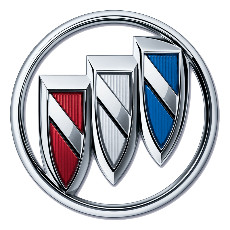
- The crest was replaced by three narrow shields, which were enclosed in a circle.
- Each shield was colored in its own tone — blue, white and red, to celebrate the three-car models (Electra, Invicta, LeSabre respectively).
- It is executed in white, which created a bright contrast with the red background.
- 1980 – 2002 The Hawk was replaced by the tri-shield emblem in 1980.
- The wordmark in black capital letters was placed underneath the emblem.
- The deer and cross left the crests and the diagonal line is solid silver now.







Leave a Review