Sanyo logo and symbol, meaning, history, PNG
- 1947 — 1949 For the first two years of its history, the company used the National logo, which was then owned by what is now Panasonic Corporation.
- 1949 — 1953 The earliest Sanyo logo that featured the company name was introduced in 1949.
- Below the cursive script wordmark, there was a lightning bolt design.
- 1953 — 1955 This time, the script grew lighter.
- The wordmark still seemed to have been written by hand.
- It was now oriented not diagonally but horizontally.
- It was unlike its predecessors because it was much bolder.
- 1961 — 1967 Eventually, Sanyo opted for a clearer font in 1961.
- This time, the wordmark was paired with a roundel housing three arrowheads.
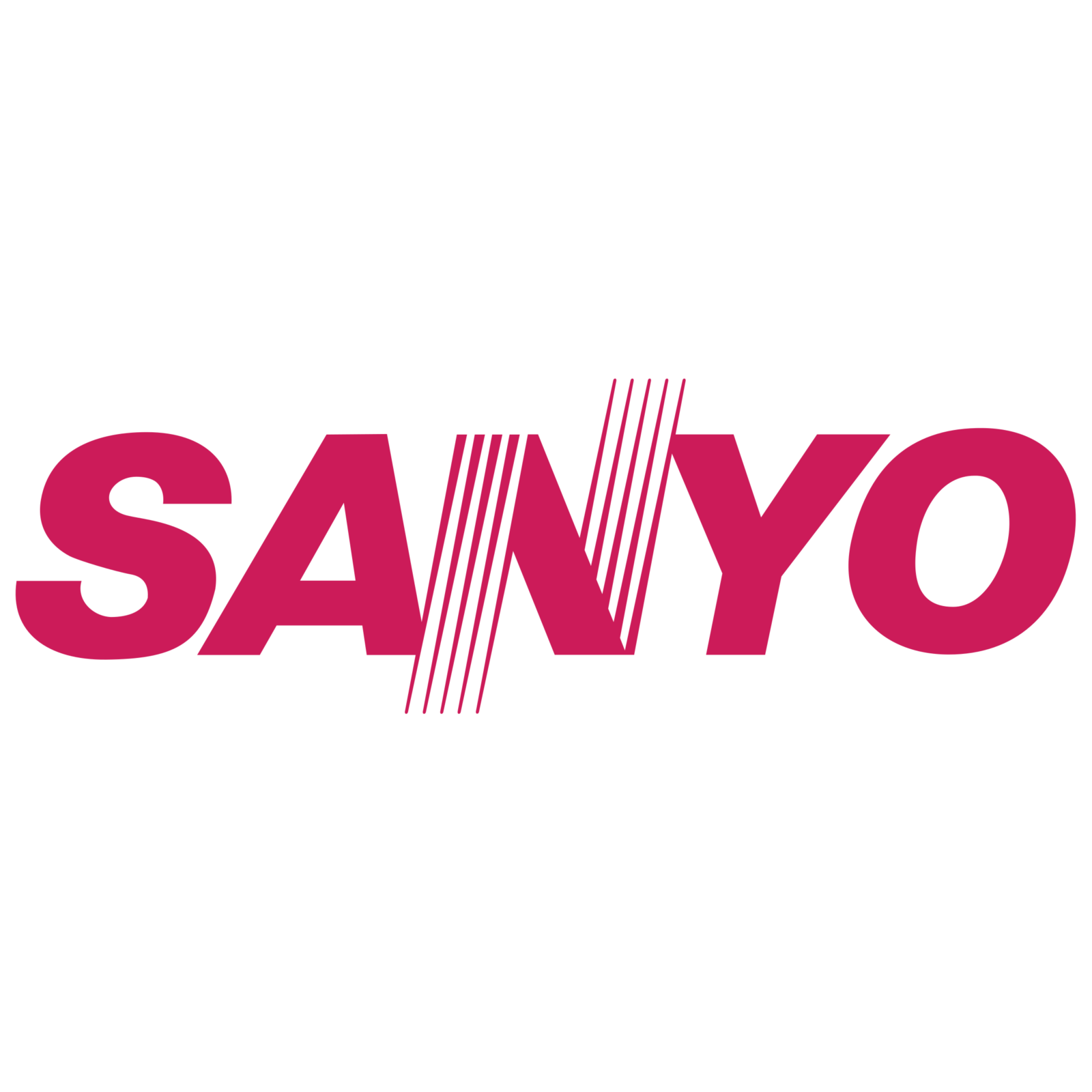
- 1967 — Today The current Sanyo logo looks perfectly legible due to its classic sans serif typeface.
- Symbol The earliest logo that belonged to Sanyo itself and featured the company name was introduced in 1949.
- Below the cursive script wordmark, there was a lightning bolt design.
- Although in 1958 the company adopted a script wordmark once again, it eventually opted for a clearer font in 1961.
- Font The typeface bears an uncanny resemblance to the grotesque font Helvetica Neue Black Italic.






Leave a Review