Eibach logo and symbol, meaning, history, PNG
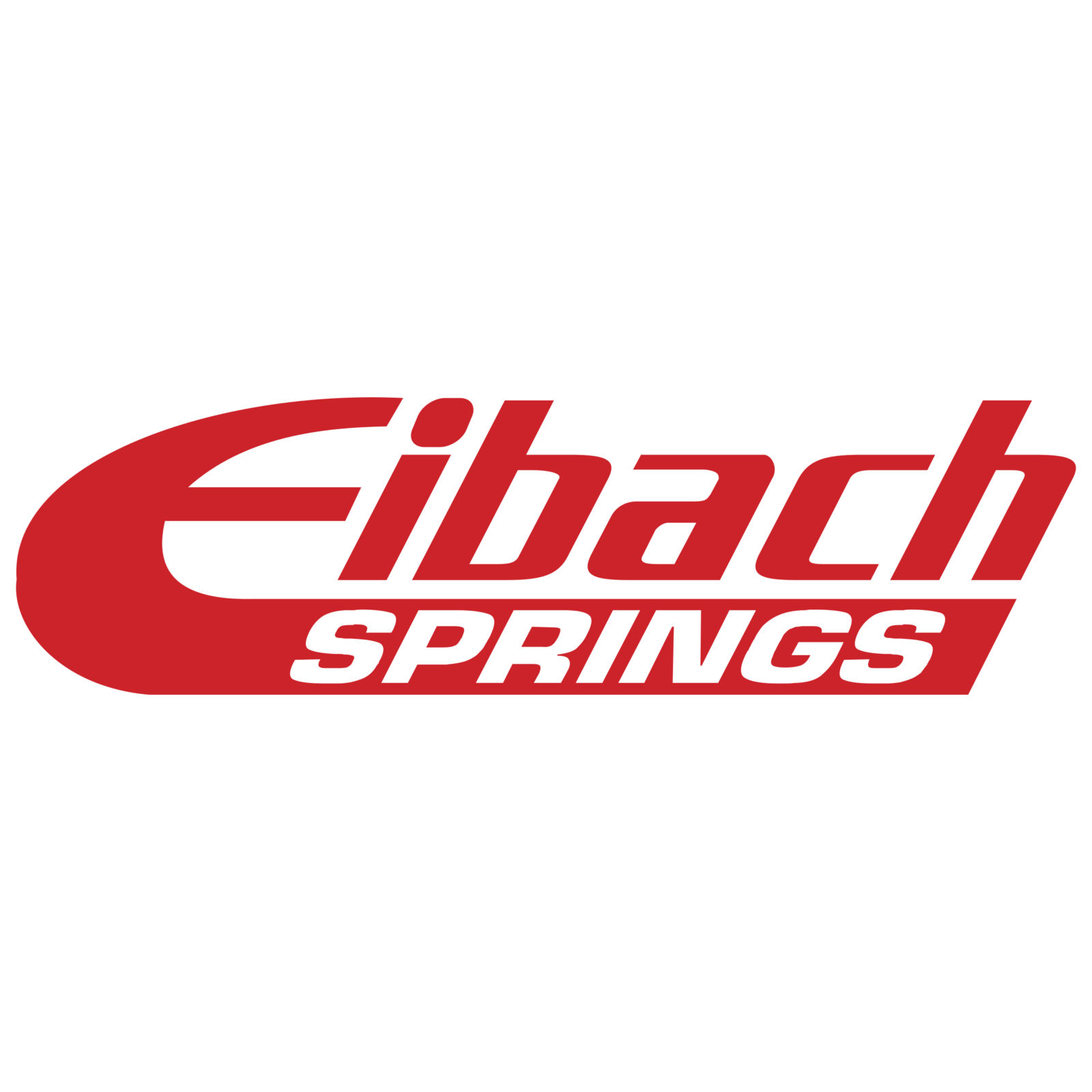
- Download PNG Eibach Logo PNG The logo of Eibach Federn, a German manufacturer of automotive coil springs (OEM and racing), reflects the dynamic spirit of the company.
- According to the company, they create their products “to meet the extreme requirements of racing.” They emphasize that their products are in no way like the chassis of a production vehicle where the minimum cost is one of the most important requirements.
- The unusual rounded shape of the initial “E” seems to have been inspired by the road.
- The glyph has an elongated end stretching under all the other letters.
- It is white with red squares.
- The squares form a dynamic pattern inspired by “a lower, more muscular, more athletic stance” the company’s products are supposed to deliver.
- 1992 – 1994 The previous logo featured a somewhat similar wordmark, although you could see several notable differences.
- Instead of the red squares, there was the word “Springs.” Also, the old Eibach Federn logo featured a calmer, darker shade of red than the current one.





Leave a Review