Popeye logo and symbol, meaning, history, PNG
- Download PNG Popeye Logo PNG Popeye the Sailor is a fictional cartoon character.
- He was first drawn by Elzie Crisler Segar and made his first appearance in 1929.
- Since then, he has made multiple appearances in all kinds of theatrical and TV animated cartoons.
- And yet, it has almost always preserved its heavy weight that perfectly echoes the look of the muscular Popeye himself.
- July 1933 For only a month, the cartoon started with the name of the character written in a light, generic sans serif typeface.
- 1933 – 1939 The light and “serious” sans was replaced by a plump, rounded, and playful one.
- The glyphs “danced” – some of them were tilted to the right, others were tilted to the left, while some letters stood straight.
- 1939 – 1941 One again, the letters played on the contrast between the widths of the strokes.
- Yet, their shape was smoother, and they looked heavier.
- 1941 – 1942 The same year, a version with squarish letters was introduced.
- The angles were still slightly rounded, though.
- 1960 – 1962 1970’s – now A completely new era started for the Popeye logo.
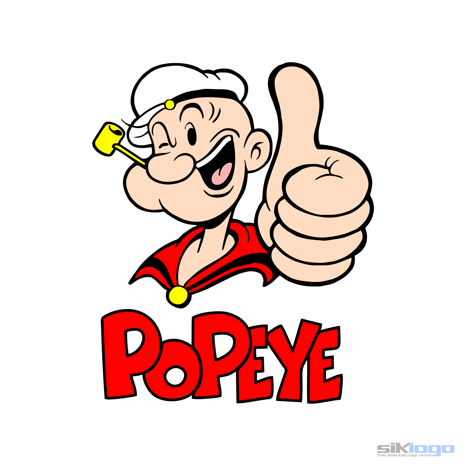
- Here, the letters are still pretty “muscular.” The “P’s” and “O” are based on circles, while the “E’s” and “Y” are angular.
- In addition to the better-known red version, there is also a blue logo with an anchor and straight, regular glyphs.


Leave a Review