Getafe logo and symbol, meaning, history, PNG
- Download PNG Getafe Logo PNG Getafe is the name of a Spanish football club, which was established in 1983.
- O day the club plays pretty successfully in La Liga and has Jose Bordalas as the head coach.
- Getafe is owned solely by Angel Torres Sanchez.
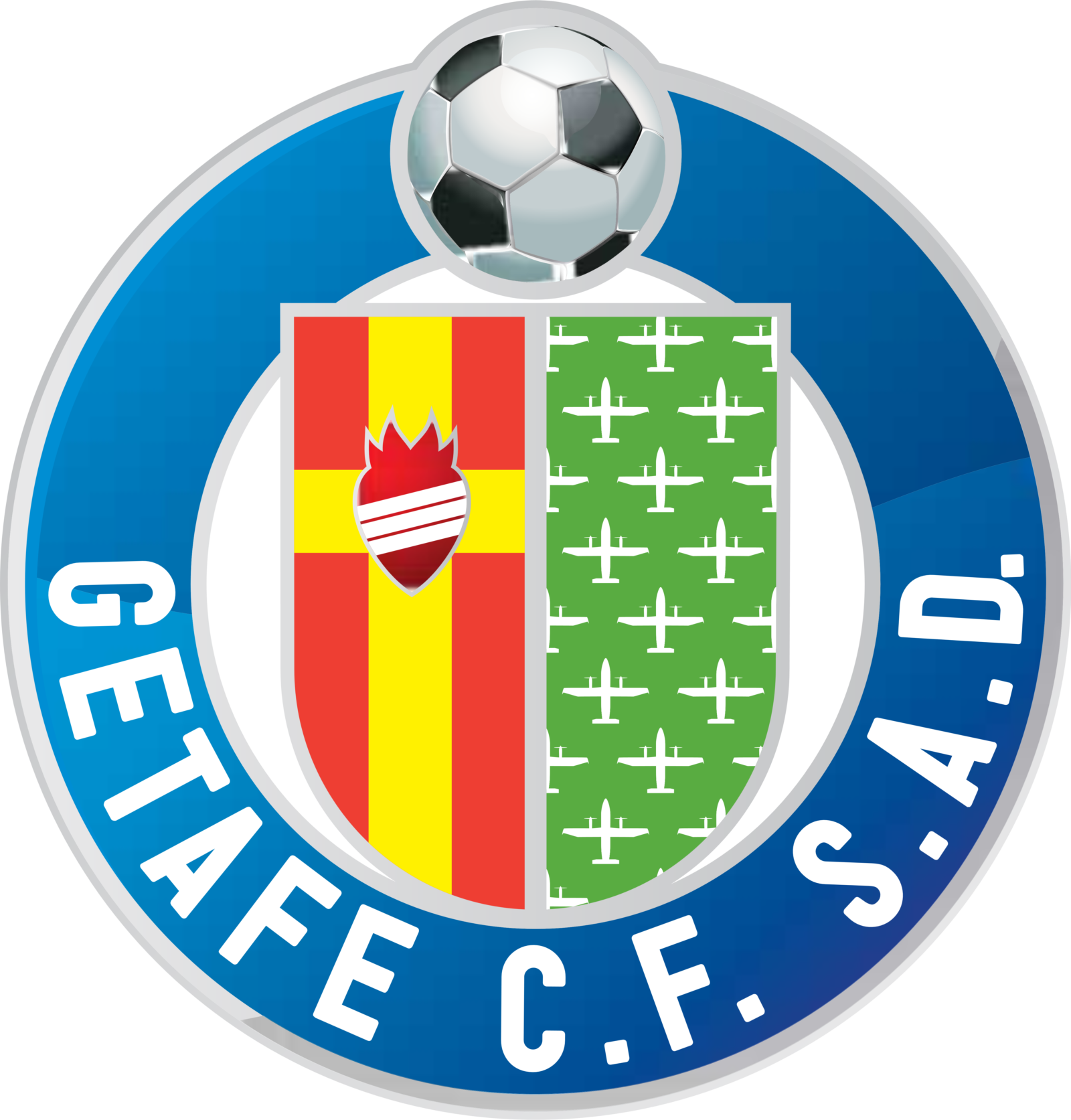
- Meaning and history Though the famous Spanish club had numerous visual identity redesigns throughout its history, there were only two main versions of the logo, the first one, which only existed for one year, and the current emblem, which was created in 1983 and was only refined and modernized by today.
- 1982 — 1983 The first, trial, badge for Getafe was composed of a bright blue circular badge with a very wide outline and a red middle.
- The lettering on the flag was only composed of “F.C.” in an old-style elegant font, while the main wordmark, the “Club Getafe Deportivo” was written in a bold modern sans serif around the right side of the circular frame.
- The inscription also featured yellow color and a delicate black outline.
- 1983 — 1996 The redesign of 1983 brought the first version of the iconic Getafe logo.
- It was a green and red crest of the city of Getafe in the Municipality of Madrid, enclosed in a wide light purple circular frame with a black wordmark on it.
- 1996 — 2003 In 1996 the color palette of the logo became lighter and the wordmark was changed to “Getafe C. F. S. A. D.”.
- 2003 — 2011 The colors for more intense in 2003.
- And the Getafe crest got enlarged, so there was less white space on the badge now.
- The wordmark changes its color from black to white, making the emblem even brighter.
- 2011 — Today The redesign of 2011 made the iconic logo more modern and sophisticated.




Leave a Review