evolution history and meaning
- Download PNG Airbus Logo PNG During the previous two decades, the Airbus logo has gone through two modifications.
- While the alterations have been rather notable, we can surely say that each new design was based on its predecessor.
- Due to this, the overall style has remained consistent.
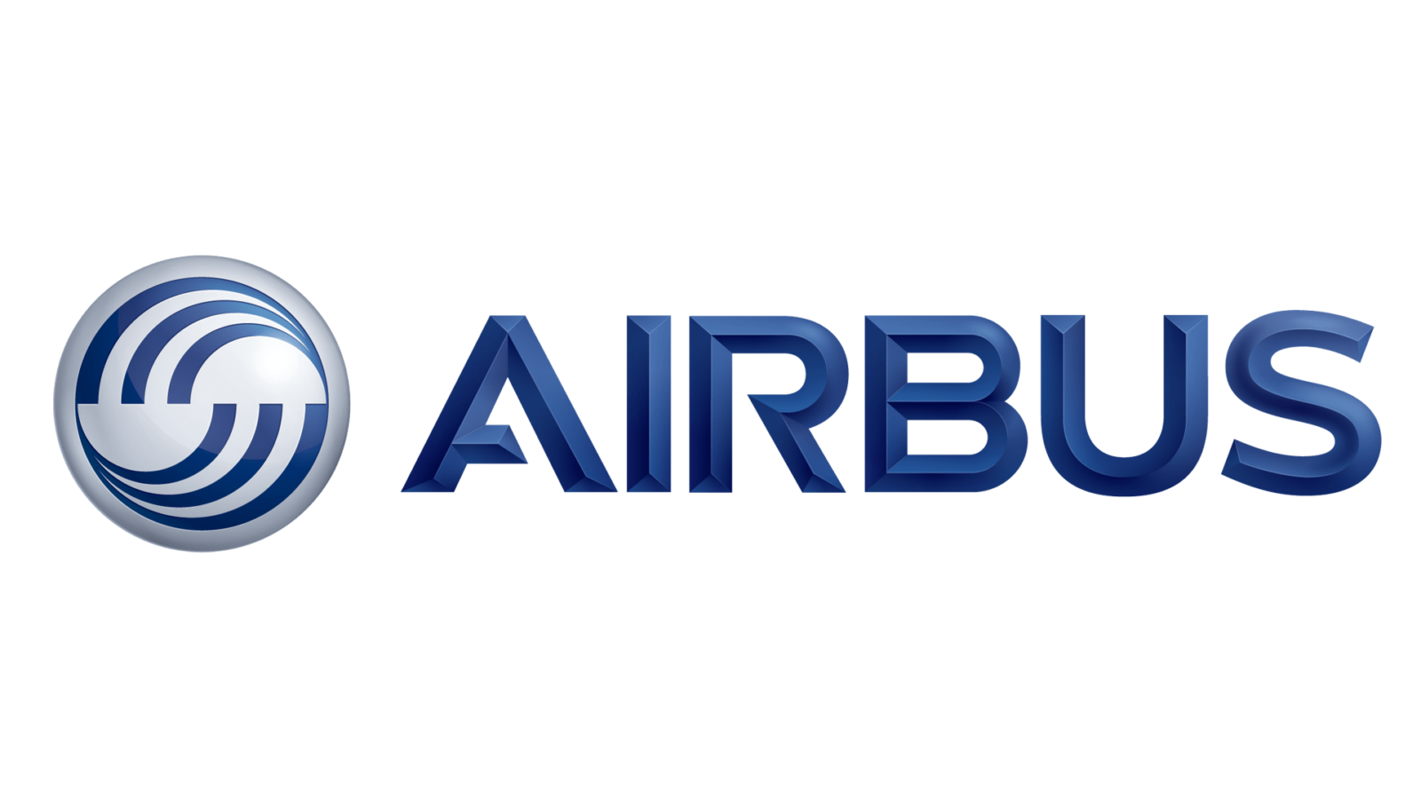
- Meaning and history 2001 The design is dominated by a circle broken down into two identical halves.
- In each of the halves, there is a dynamic abstract pattern inspired by curves, whirls, and swooshes.
- While it is still a sans, it is not italicized now and has a couple of distinctive details – the gaps in the “A” and “R,” for instance.
- Also, the lettering has a 3D look due to the addition of the gradient.
- 2017 The updated Airbus logo is flat and does not feature the whirl emblem – only the wordmark.


Leave a Review