Batman logo and symbol, meaning, history, PNG
- Download PNG Batman Logo PNG Batman is a renowned character of American comic books (DC Comics).
- Emblem evolution in the comics 1939 The first version of the Batman emblem (1939) was probably the most minimalistic one – nothing but wings.
- In most versions of the emblem, it was the same as in the original one, five.
- The emblem was typically wider than its predecessors, while the exaggerated long wing points along the bottom and on the top grew shorter.
- 1946 – 1950 The 1946 Batman logo returned to the original in terms of the length of the central wing point – it now looked much longer and sharper than all the other wing points along the bottom, which grew a little less angular.
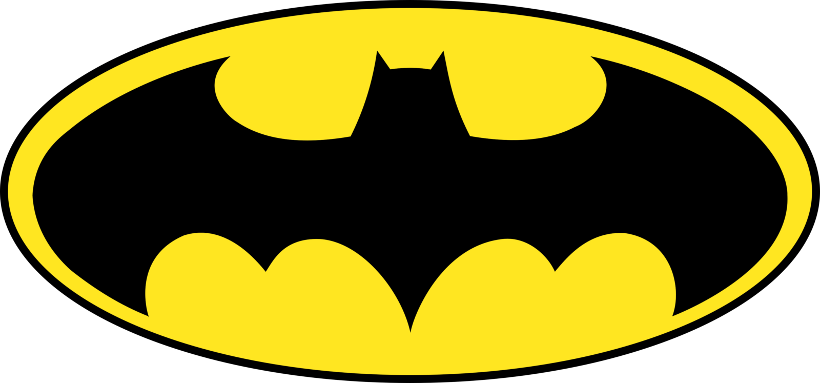
- 1964 – 1966 Probably the most notable modification took place in 1964 – the emblem was positioned inside a bright yellow ellipse with a black outline.
- Interestingly enough, initially, the addition of the yellow ellipse didn’t affect the shape of the emblem that much – just the sides of the wings became more curved, and the outside wing points on the right and left grew shorter.
- In 1966, for the first time, the sides of the wings adopted a very prominent curve.
- The yellow oval was gone, while the shape of the wings became closer to the versions of the 1940s and 1950s, especially the 1946 emblem.
- However, in comparison with the version that appeared in comics, there was much more wing detailing in the image.
- 1949 When costume designers were developing a new emblem for the 1949 serial “Batman & Robin,” they decided to take the 1943 version, with its wing detailing, as the major source of inspiration.
- However, this time, the bat became larger.
- 1967 1977 1989 The emblem featured in the 1989 movie Batman starring Michael Keaton already featured a larger bat in a yellow oval with a thick black outline.
- Interestingly enough, the logo on the legendary movie poster showcased the bat with five wing points along the bottom, while in the movie itself, the bat had wings with seven points.
- In comparison with the bat from “Batman Returns,” this one had broader wings, with a shorter tail and the wing points along the bottom of the bat.
- While the emblem was black on black, it now borrowed the oval shape from the comics logo, although it wasn’t yellow.
- 2016 – 2017 An utterly different bat, with large and broad wings, appeared in the 2015 movie “Batman v Superman.” It was rather similar to the emblem featured in the 1986 comic book The Dark Knight Returns, although the creature now had a more pronounced tail and more elaborate wing tops.
- Here, the superhero appears with the good old yellow ellipse emblem on his chest, which looks like the logo used in comics released from 1966 to 2000.
- Icon The Batman icon has changed several times throughout the years of the superhero existence.
- Batman vs Superman logo The Batman logo is also part of the logo that brands “The dawn of Justice”: Batman vs Superman.


Leave a Review