Barbie logo and symbol, meaning, history, PNG
- Meaning and history The Barbie visual identity is one of the not many examples when the brand comes back to its original logo version after numerous redesigns.
- There were five major redesigns of the Barbie emblem, but in 2009 the company decided to return to its roots, adopting the very first version of the fancy girly logotype as its official logo again.
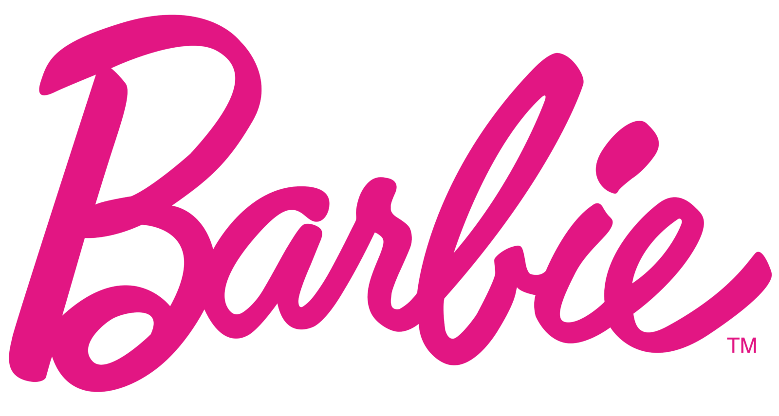
- 1959 — 1975 The original Barbie logo, introduced in 1959, was composed of a bright pink inscription in custom cursive with letters slightly numbing above the line.
- 1975 — 1991 The redesign of 1975 brought another long-lasting version of the emblem for Barbie, it was a diagonally locates inscription in white bold sans-serif, outlined in bright pink with the pink wide shadow.
- 1999 — 2004 The redesign of 1999 brought back the bright and intense shade of pink, making the logotype in smooth cursive again, confident and trendy.
- The inscription, which featured a handwritten typeface with fancy letters, looked playful and friendly, staying girly.
- Symbol The current Barbie logo is just another version of the very first one.
- Emblem evolution What can we say about the original Barbie logo?
- From all the emblems Barbie has had so far, this one has the most uneven line.
- It looks pretty without trying too hard, and you can imagine the girl it represents – somewhat naughty, yet absolutely adorable.
- A decade later, the brand adopted a 3D version of this logo, which was replaced by a completely different style in 1975.
- This time, the insignia wasn’t effortless at all.
- All the letters, except the initial uppercase “B,” had the same height and followed a single line.
- Probably the most unusual letter of the 1975 logo was the initial “B,” which had two curves.
- While the one on the top was somewhat smaller, the lower curve was almost impossible to overlook.
- All the other letters had slightly thicker ends, which resulted in a barely perceptible “handwritten” effect adding some spontaneity.
- How can we translate these modifications into the style of the girl the logo represents?
- During the following fifteen years, the company also used a version where the name of the doll was rotated to the left so that the letters formed a horizontal line.
- The shape of the letters of the 1999 logo grew closer to the original logo with its effortless elegance.
- As for the color of the 1990 logo, it looked closer to the original logo than to the 1975 version, although it was somewhat lighter.





Leave a Review