evolution history and meaning
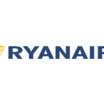
- Download PNG Ryanair Logo PNG Over its 35-year history, the Ryanair logo has been growing simpler and better legible.
- The word “RyanAir” was made up of very unusual glyphs.
- Instead of a single line, they were “written” with three lines (two blue and one white).
- 1987 There is something similar in the shape of the “R,” yet the type is new.
- This time, it is solid.
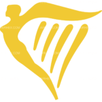
- A gold bird in flight is placed to the left.
- 2001 The company name in bright yellow is placed inside a blue rectangle.
- 2013 The design echoes the 1987 version, although the type has been simplified.


Leave a Review