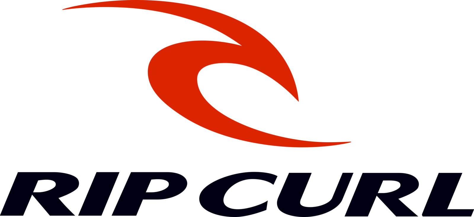
Rip Curl logo and symbol, meaning, history, PNG
- Meaning and history The earliest design was cluttered almost to the point of illegibility.
- In spite of all its issues, this logo was recognizable and, for quite a few people, was a symbol of a certain lifestyle and era.
- As the brand was growing, the design forces behind it had to make the brand identity friendlier and easier to grasp.
- The creative search resulted in the wordmark “Rip Curl” in a very simple, yet unique type.
- The second interpretation of the rainbow theme looked brighter, more dynamic and distinctive.
- There was more depth to it, too.
- Originally, the wave was placed inside a rhomboid, while the company name could be seen above.
- The wordmark looked almost the same as in the previous version, except for the color (this logo was black-and-white).
- The designers colored the logo in two shades of blue leaving white and black as additional colors.
- Only one shade of blue was left.
- The palette was now dominated by red, with little patches of blue and a white background.
- The type was a more generic rounded one.
- Both the type and the emblem grew more minimalist.
- The wave became the centerpiece of the Rip Curl logo.


Leave a Review