Sun Bowl Logo and symbol, meaning, history, PNG
- The logo was executed in a yellow and white color palette, with not a single contrasting accent.
- 1978 – 1985 The redesign of 1978 made the Sun Bowl logo even simpler than it was.
- The center of the badge was taken by a white wordmark set in two levels on a plain yellow background and executed in a modest and traditional sans-serif typeface, in the uppercase.
- 1986 – 1988 A new color palette was adopted for the Sun Bowl visual identity in 1986.
- Now the badge features a half-circle shape, with a yellow, orange, and green background, decorated by a thin orange stripes pattern, coming horizontally through the whole yellow part of the logo.
- The “Sun Bowl” inscription was now set on the upper part of the badge, set in an emboldened uppercase sans-serif typeface, in white and green.
- The star pattern was replaced by a sun one with elongated rays coming out of the redrawn mountain landscape.
- 1996 – 1998 The stylized half-sun was redesigned with its rays getting square in 1996.
- As for the lettering part, it was now executed in a smooth and bold cursive and set along the bottom line of the sun, in green, with thin white and thick blue outlines.
- It was a green capital “N” formed by several solid squares separated by thin white lines, and a slanted sans-serif wordmark in blue capitals, written over the middle part of the “N”.
- The badge featured a horizontally oriented rectangular shape and was executed in a deep blue and dark yellow color palette, with the silhouette of three horses carrying a cart, and a delicate half-sun symbol placed at the bottom, over a white serif “Sun Bowl” inscription in a rounded and bold serif typeface with an uneven surface of the capital letters.
- 2004 – 2005 A black and gold smooth crest became the new official logo of the bowl for only one season in 2004.
- It was under the Vitalis sponsorship, so the largest, the black part of the shield was taken by its logo — a sharp narrowed “V” in dark red and a white wordmark in a slightly slanted sans-serif typeface.
- The upper part of the badge was embedded with a clean and sharp image of the sun, while its arched stylized drawing was set under the “Vitalis” inscription, and above the bold and uneven “Sun Bowl” lettering in white capitals, written over the wide gold part of the frame.
- 2006 – 2009 The rounded solid green badge replaced the Vitalis logo in 2006.
- As for the main logotype, it was written in its custom smooth typeface with its bold white capitals featuring a cracked and slightly erased pattern of the surface, with gray lines.
- The stylized sun, depicted by a bold yellow arched line and five small triangles pointing up above it, was set above the bottom letter line, on a plain green background.
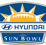
- 2010 – 2019 The redesign of 2010 introduced a new bold blue crest with Hyundai as the sponsor of the bowl.
- The upper part of the logo featured a yellow and white half of the rugby ball with sharp rays coming out of it.
- The top level of the banner was colored blue and contained the sponsor’s logotype, while the bottom part was colored orange and had the “Sun Bowl” written on it in white.





Leave a Review