Lion Air Logo
- Download PNG Lion Air Logo PNG The logo of the Indonesian airline Lion Air features the lion theme, while the airline theme is not so obvious.
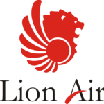
- Meaning and history 1999 In its basic structure, the original Lion Air logo was the same as the current one: it also featured the lion emblem in the middle of the wordmark.
- Yet, the palette and typography made it look different from the current one.
- The words “Lion Air” were given in dark blue (with the exception of the stroke on the “A”).
- Also, the glyphs were by far lighter and featured a serif type.
- In between the two words, you could see the side view of the lion’s head with a feathered circle.
- The company also used a monotone red variation, yet it was not the primary logo.
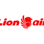
- 2008 The refresh resulted in a new, more modern and dynamic typography.
- There were no serifs now, and the overall shape of the letters was more streamlined, which worked great for the airline theme.
- Font The Lion Air logo features a dynamic custom sans with bold italicized glyphs.
- Company overview The full name of the company is PT Lion Mentari Airlines.
- Lion Air is a low-cost airline based in Jakarta, Indonesia.
- It is known as Indonesia’s largest privately run airline and the 2nd-largest low-cost airline in Southeast Asia.
- The company has 118 airplanes and flies to 126 destinations.





Leave a Review