Unilever logo and symbol, meaning, history, PNG
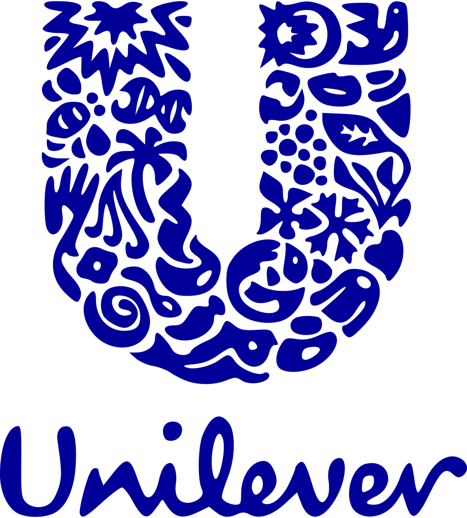
- Download PNG Unilever Logo PNG The Unilever logo features a big blue “U”, the company’s initial.
- The letter comprises several icons each having its unique connection with the business.
- Meaning and history Though the history of Unilever starts in 1929, its first logo was created only in 1967 and got redesigned just once, in 2004.
- This is a truly impressive consistency for such a large company, which tells a lot about its stability, fundamental approach, and quality-centrism.
- 1967 – 2004 The very first Unilever logo, created in 1967, featured a pleasant and delightful blue and white color palette, which looked fresh, bright, and very friendly.
- It was a combination of a bold and eye-catching emblem, and a delicate traditional logotype, placed under it.
- The emblem depicted a stylized letter “U”, which has the edged of its vertical lines triangular, looking like arrows.
- The vertical bars of the “U” resembled two towers and looked powerful and elegant.
- As for the logotype, it was written in the title case of a sleek and slightly extended serif typeface, which added stability and confidence to the image.
- The only thing that remained untouched was the structure — an enlarged “U” above the wordmark, though all other elements were redrawn.
- Secondly, the “U” gained rounded contours and its body was formed by 25 small images, symbolizing all the directions the company works in.
- And, finally, the logotype.
- It was completely changed and now is executed in a handwritten cursive with smooth rounded lines, looking modern, yet friendly.
- Symbol meaning One more Unilever symbol is a bee, which symbolizes creative work, pollination, as well as environmental challenges.


Leave a Review