Olympics logo and symbol, meaning, history, PNG
- The same visual theme was chosen for the emblem of the 1900 Summer Olympics in Paris.
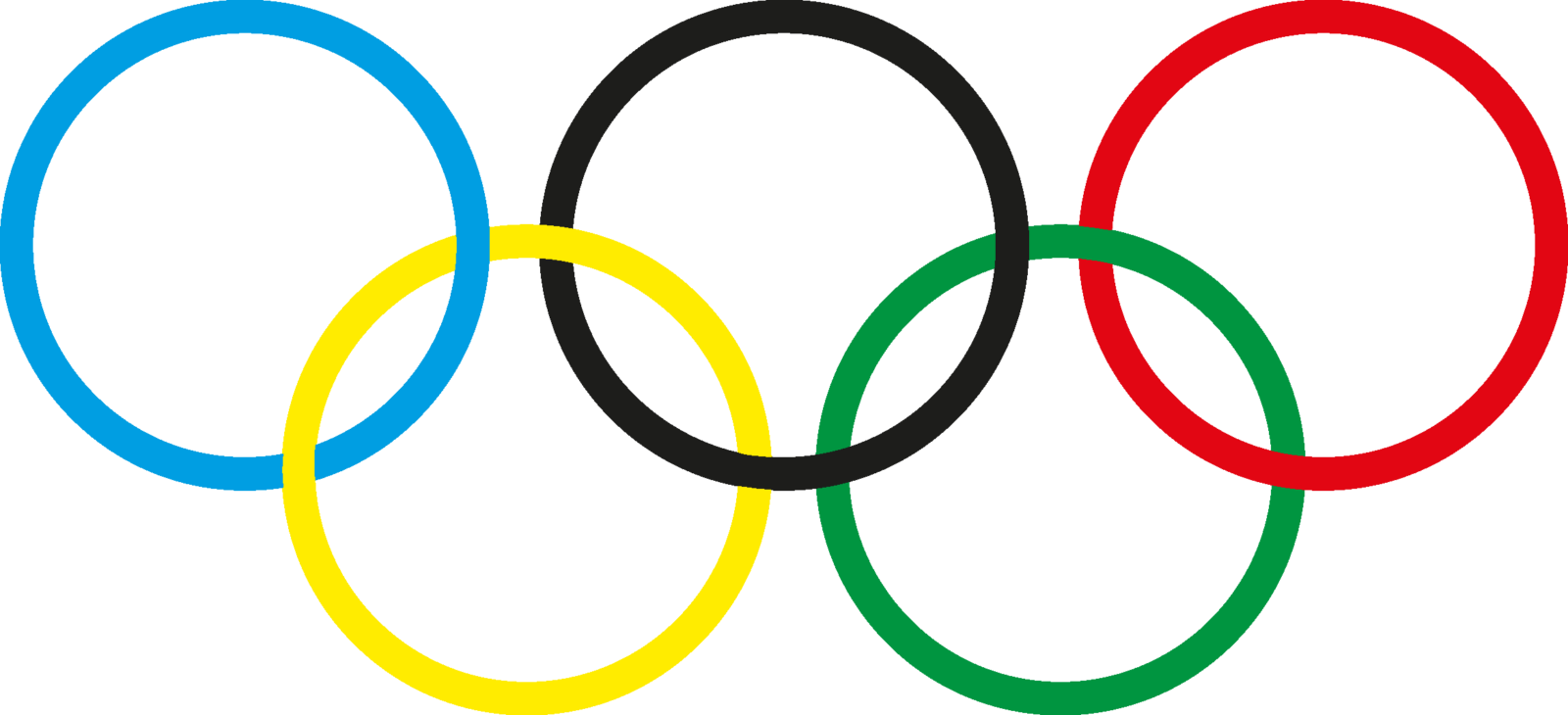
- The original iconic five rings logo of the Olympic Games was introduced in 1912 and featured thick lines of the five colored elements.
- 1986 – 2010 The redesign of 1986 refined the contours of the rings and added some thin white lines to the place of their intertwining.
- The colors were also refined and made more delightful.
- This logo definitely looked more professional and stylish than the original version.
- 2010 – Today The 2020 symbol Olympics The symbol for the Tokyo 2020 Olympic Games was created by Japanese graphic designer Kenjiro Sano.
- One of its characteristic features is a red circle.
- It is supposed to remind the circle from the Japanese flag.
- There are also blocks of grey and gold in the shape of the letter “T”.
- The rings emblem Olympics The history of the Olympic rings dates back to 1912.
- The author of the design is Baron Pierre de Coubertin, one of the founders of the current version of the Olympic Games.
- The color scheme of the rings included the colors of each country taking part in the Olympics back then.
- Font The current version of the Olympics logo utilizes a simple serif typeface, all the letters are capitals.
- Color The palette includes red, yellow, black, grey, blue, green, and white for the background.


Leave a Review