Eurolines logo and symbol, meaning, history, PNG
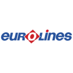
- Download PNG Eurolines Logo PNG Eurolines, a European intercity coach service, has been pretty consistent in its visual brand identity over the last couple of decades.
- While the logo may look a little too long, this becomes an advantage when it is placed on the sides of the buses.
- The emblem is made up of the white letter “o” inside a red square standing on one of its sharp ends.
- In addition to being the company’s symbol, the “o” also is a part of the wordmark standing right in the middle of it.
- All the other letters are dark blue, with the only exception of the dot above the “i” – the dot is red.
- Font The type in the Eurolines logo is an unpretentious sans.
- What makes the writing unusual is the way it combines capital letters (the “r” and “l”) with lowercase ones (“e,” “i,” “n”).
- One of the reasons was probably the need for clarity – when the lowercase “L” is used, it looks like the “i,” so it has been replaced by the capitalized version.




Leave a Review