evolution history and meaning
- Download PNG Motörhead Logo PNG Motörhead is a British rock-band, which was created in 1975 by Lemmy Kilmister, after he was fired from the Hawkwind band.
- The group was a mastermind and ideologist of the heavy metal new-wave in Britain.
- It was changed to Motörhead soon enough after the formation.
- It is a strong and provocative name, that fully represents the band’s character and music style.
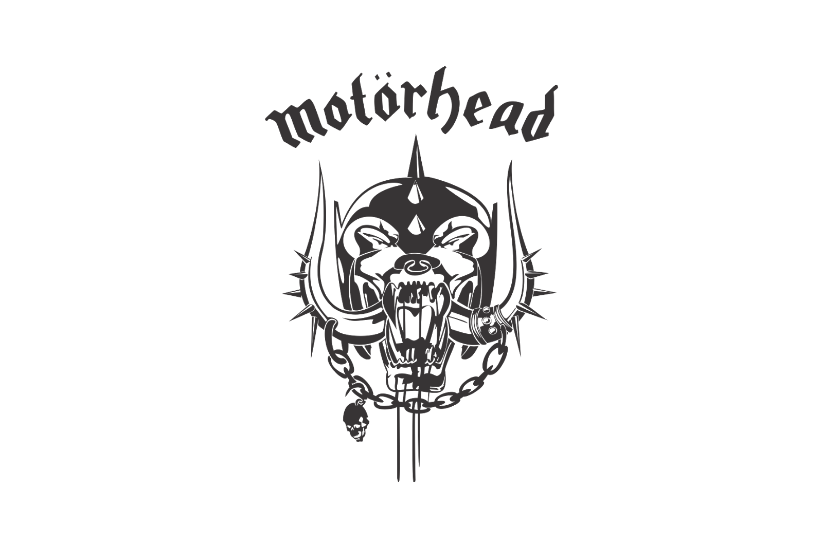
- The Motörhead logo is composed of a wordmark and their signature emblem.
- The closest font to the Motörhead typeface is Fette Unz Fraktur, which was designed by Peter Wiegel.
- The two dots above the second “O” do not affect the pronunciation of the word, Lemmy Kilmister just loved the way it looks, so the Motörhead got its “Ö”.
- The color palette of the Motörhead logo is monochrome, and the nameplate is sometimes drawn in red, which is a symbol of passion and power.
- The combination of black and white makes the band’s famous emblem stand out.
- The Snaggletooth was created in 1977 and has never left the band’s logo.
- It is a fanged mug with tusks and spikes, which was designed by a famous artist Joe Petango and first appeared on the cover of the Motörhead debut album.
- Petagno came up with the idea of a hybrid of gorilla, wolf and dog with wild boar tusks.
- The drawing is very detailed, and first was made in ink.
- The Snaggletooth was only slightly modified during the history by the artist.


Leave a Review