Eredivisie logo and symbol, meaning, history, PNG
- One of the top10 leagues in Europe, the Eredivisie is composed of 18 football teams, which compete for the main prize.
- The new era of the visual identity for the league started in the 2000s when it was renamed into Eredivisie.
- 2000 — 2002 The logo, designed for the league in 2000 was composed of a blue inscription in the lowercase with a graphical emblem on the right.
- The whole construction was enclosed in a horizontal rectangular frame of green color, with its left part in solid green, containing the white “KPN” lettering.
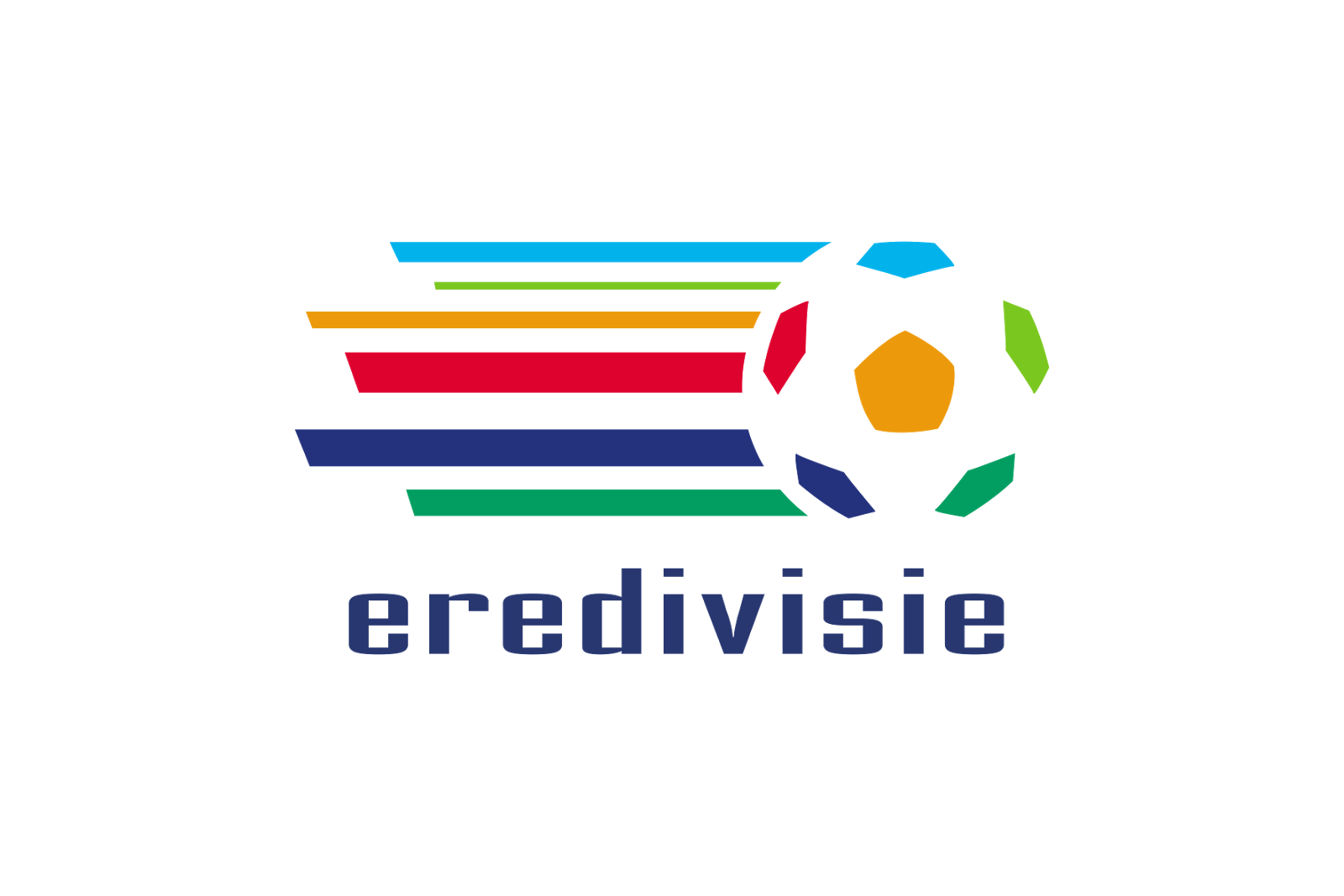
- The main wordmark was executed in a modern lightweight geometric sans-serif typeface, and the emblem depicted a colorful football with numerous horizontal stripes on its left.
- Each stripe had its own color and aimed to represent speed, movement, and passion.
- 2002 — 2004 The logo from 2002 was composed of a green “Holland Casino Eredivisie” nameplate, turned around a small angle, and an emblem, representing a square stadium and field, with a white football flying out of it.
- The stadium image was drawn in a multi-color palette, which resembles a previous logo version.
- 2005 — 2017 In 2005 the league started using the part of the logo, designed in 2000 as an official one.
- The multicolor stripes featured different thicknesses and had their sides cut diagonally.
- 2017 — Today The logo we all can see today was introduced in 2017.
- Font and color The Eredivisie wordmark is executed in a custom sleek sans-serif typeface with bold clean lines.
- The blue and white color palette of the Eredivisie visual identity is a reflection of the stability, confidence, and professionalism of all the teams and players.
- It evokes a sense of trustworthiness and promises all the people watching the league the best experience.






Leave a Review