Bruno Mars logo and symbol, meaning, history, PNG
- Download PNG Bruno Mars Logo PNG Bruno Mars is the stage name of one of the world’s most popular pop singers and songwriters who were born in 1985 in Hawaii.
- His career started in 2004 and since that time Bruno Mars has released three albums and sold almost 150 million copies across the globe.
- It has only been changed once, but both versions brilliantly reflect the singer’s character and unique style, evoking a sense of drive, light, and movement.
- There is nothing too complicated in the singer’s logo — just a wordmark, set in two levels, with “Bruno” above “Mars”, but the custom typefaces and intense solid colors create an atmosphere of professionalism, passion, and power.
- 2010 — 2012 The logo from 2010 was executed in a monochrome color palette with condensed black capital letters.
- Everything about Bruno Mars evokes a feeling of dynamics and energy, and even the black bold lettering, which could be just a boring logotype, was designed in a unique and recognizable manner, perfectly representing one of the world’s most famous singers.
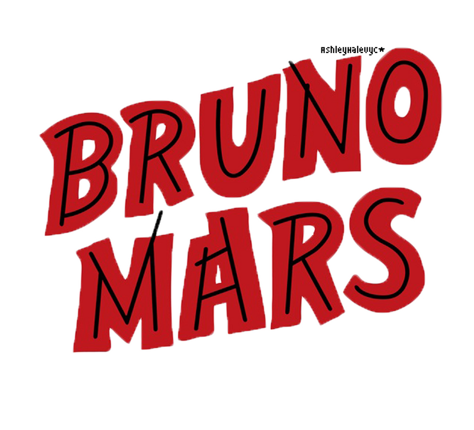
- 2012 — 2016 The redesign of 2012 brought red color to the Bruno Mars visual identity, making it even more powerful and energetic.
- The style and typeface of the inscription were also dramatically changed and became more modern and distinct.
- Now the logotype is executed in a clean and strong sans-serif font, which is very similar to Mono Spec Semi Bold, a contemporary typeface with shortened diagonal “N”-bar.
- The Mars “R” repeats the traditional contours of the sans-serif letter, but has its right vertical bar separated from the body, and drawn as a straight vertical line, which adds unique geometry to the whole image.
- The Bruno Mars logotype is instantly recognizable.
- It is a balanced and perfectly designed inscription, reflecting all the best features of the singer and the music he does.
- 2016 — Today The logo, created for Bruno Mars in 2016 was first used for his “24K Magic” album and is still used by the singer for advertising and promotional materials.
- The elegant and smooth logotype in monochrome is executed in a title-case of an italicized typeface, which is very close to Monotype Corsiva Std Regular, a timeless and sophisticated font, evoking a sense of fundamental approach and professionalism.






Leave a Review