Goosebumps logo and symbol, meaning, history, PNG
- Download PNG Goosebumps Logo PNG Goosebumps is the name of horror-books series for kids, which was first published in 1992.
- The series instantly became popular all over the globe and by today there are almost 250 Goosebumps books written under the label, with over 400 million copies sold.
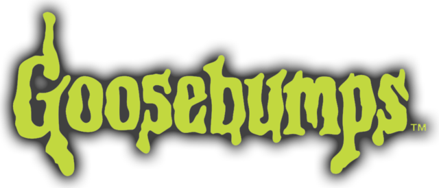
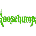
- Meaning and history The Goosebumps logo is executed according to all the most important principles of a horror logo — it is bright, memorable, and has a very unpleasant look due to the colors and contours chosen.
- Cool and modern, it looks slippery, sticky, and cold, like you are touching something slimy.
- The logo is composed of just a green wordmark.
- The Goosebumps inscription in the title case is executed in a custom font with extra thick lines and uneven edges.
- The dripping letters look like slime or mucus, colored in a poison-green.
- When placed on a light background, the green letters gain a thin black outline, and sometimes the letters’ color is gradient and light in order to give the whole logotype a three-dimensional look.





Leave a Review