Sunderland logo and symbol, meaning, history, PNG
- Meaning and history Though the number of the visual identity redesigns for the British football club is pretty impressive, their iconic striped logo was first introduced at the beginning of the 1960s, and since then was only refined from time to time, as for the final version we all know today, it was created in 1997, and is fully based on the previous crests’ designs.
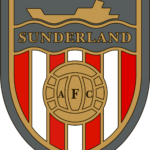
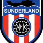
- 1963 — 1972 The Sunderland logo, created in 1963, was composed of a traditional shield-shaped badge with a red and white vertical striped pattern.
- The upper part of the shield was colored calm blue and had its bottom edge wavy, resembling a water line.
- On the striped part of the crest, there was a solid black circle in a blue outline placed, the circle featured white lines, making it look like a football, and an “AFC” lettering, also in white.
- The “Sunderland” inscription was located on the blue part of the badge, under the black geometric ship silhouette.
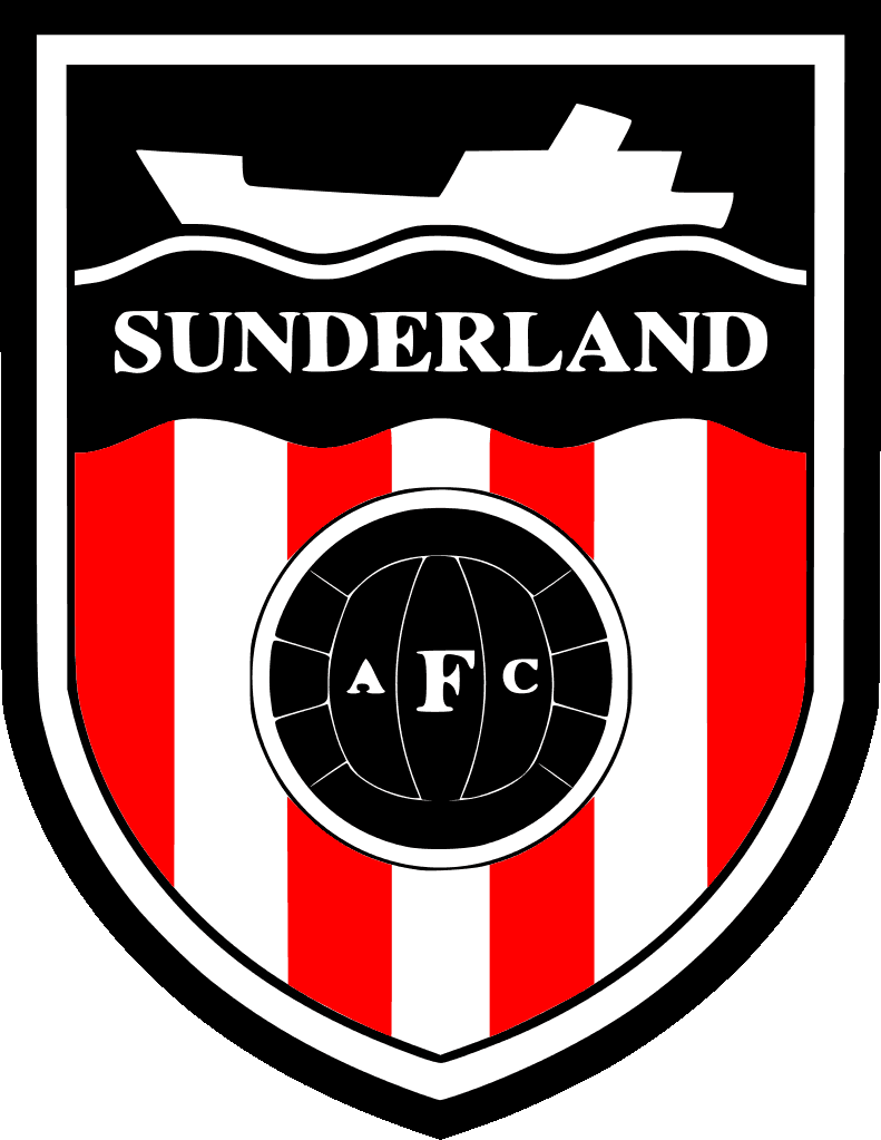
- 1972 — 1977 In 1972 the blue part of the crest was changed into black, and the ship was now in white.
- It made the logo look more masculine and brutal, though this version only stayed with the club for five years.
- The inscription features the same bold serif typeface as in the previous version.
- No other changes, it is exactly the same crest as the one from 1977, only with the different color of the upper part.
- 1999 — Today The new crest was created for the club in 1999.
- It is composed of a red and white shield, divided into four segments — red and white stripes on the upper right and bottom left ones, and solid red with golden detail for the upper left and bottom right ones.
- The shield boasts a red, black, and white ornament on top, with a red ribbon crossing it horizontally.
- The wordmark is now written in white over the red ribbon, arched under the crest.
- Video





Leave a Review