Alfa Romeo logo and symbol, meaning, history, PNG
- Which creature is featured on the Alfa Romeo car logo?
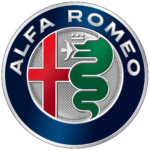
- The iconic Alfa Romeo logo depicts a green serpent with a red man’s body in its mouth.
- Despite the change of the name at the very beginning of the brand’s history, it has kept its original logo, designed in 1910 and this ornate and colorful badge is one of the most recognizable car emblems today.
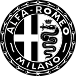
- 1910 – 1915 The original Alfa Romeo logo was designed by Romano Cattaneo, who adopted two heraldic symbols in one badge.
- The circular framing of the logo featured a dark blue color and the lettering, placed around its perimeter, was executed in light silver, with vignettes in the same color, separating two parts of the wordmark.
- As for the right part of the badge, it is much more interesting.
- Now the white bold “Alfa-Romeo” lettering in a gold outline was placed along the upper part of the circular frame, while the “Milano” inscription — at the bottom part.
- The contours of the cross and serpent were cleaned and made more confident and modern.
- Both blue shades on the badge became sleeker and more intense, and the man in the snake’s mouth became more visible.
- The most significant change except for the color palette in this logo was the absence of the “-“ between “Alfa” and “Romeo”.
- The green serpent gained a thick black outline and the man in its mouth is colored red.
- The “Alfa Romeo” part of the wordmark is now enlarged and takes the most part of the frame, while “Milano” is written in a delicate lightweight font.
- The background of the cross segment is now light blue and white, while the lettering around the blue frame features colors from silver to gold.
- Symbol The basis of the logo symbolism is the use of symbolic images associated with Italy in General and Milan in particular.
- As for the image of the red cross on a white background, it is the flag of Milan.
- The outline of this circle is highlighted in color and contains the name of the brand, Alfa Romeo.
- Initially, there was no inscription, it appeared later, as well as a wide outline, which became as the basis for the text.
- The inner part of the emblem is divided into two parts that are up to heraldic requirements – in fact, these parts occupy two heraldic elements.
- During the twentieth century, the font has changed many times.
- By the way, originally, the Royal snake in the right part of the logo was not green, but dark blue and swallowable baby was not red, but gold.





Leave a Review