Miami Heat logo and symbol, meaning, history, PNG
- Download PNG Miami Heat Logo PNG One of the most popular professional basketball teams in the US, Miami Heat was created in 1988.
- Although the logotype has been given a facelift in 1999, it basically retained its initial shape and idea.
- Meaning and history Miami Heat is the basketball club, whose visual identity history is probably one of the most modest and short.
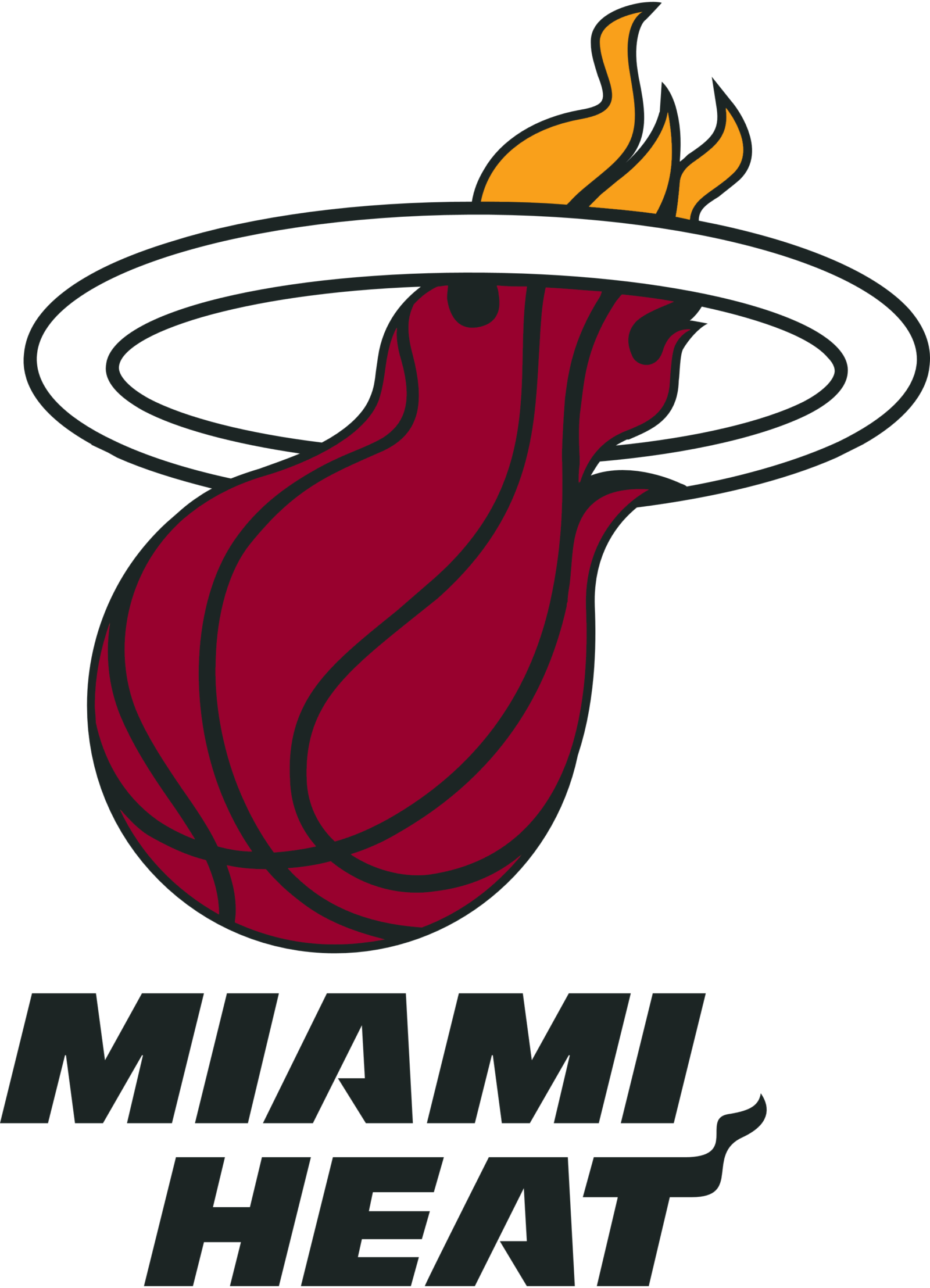
- Its original logo was created in 1988, and slightly refined just once, in 1999, keeping all but the color palette from the previous versions 1988 — 1999 The original Miami Heat logo, introduced in 1988, featured a flame-stylized gradient orange basketball with a black ring above it and a fancy bold nameplate under the image.
- The lettering was executed in a modern geometric sans-serif with thick lines and italicized contours of the letters, and the horizontal bar of the “T” elongated up and drawn as a flame.
- Another unique detail about the typeface was in the triangular cut of both “A”s bars, which added sharpness and style to the whole image.
- The ring became white, which added some lightness to a new intense palette.
- Font The most distinctive character in the Miami Heat wordmark is the last one, “T”.
- There is a shape above the horizontal bar, which supposedly symbolizes a flame.
- The letter “A” in this custom-made bold and italicized all-cap typeface is also unique and recognizable.
- All the other characters can be described as minimalistic and simple.
- Color The previous color palette featured several shades of orange, accentuated by black.
- The color choice seemed perfectly natural, taking into consideration the whole flame idea behind the badge.
- The scheme used in the current version of the Miami Heat logo (red, orange, black, and white) seems more straightforward, yet it has the same symbolic meaning and includes all the team’s official colors.


Leave a Review