Lane Bryant logo and symbol, meaning, history, PNG
- Download PNG Lane Bryant Logo PNG Lane Bryant is an American fashion brand, specialized in plus-size women clothing.
- The company was established in 1902 and today distributes its products across the globe mainly through its online store.
- And yet, it has a recognizable visual identity as for most of its history the company has stuck to the typeface of a pretty similar style.
- There have been only a couple of exceptions.
- For instance, if you compare the old version showcased above with the current logo, you’ll notice how similar they look.
- The older version is slightly heavier and has an “R” with an extended end, though.
- The effect resulted from the lighter type and the disappearance of the long end on the “R.” Also, the strokes forming the letters now had the same thickness.
- On the one hand, the designers returned the recognizable old typeface (it was used for the word “Bryant”).
- On the other hand, the authors of the logo added an original nuance by coloring the wordmark.
- 2014 – Today The Lane Bryant visual identity is based on the classic fashion industry principles — minimalism, monochrome, elegance.
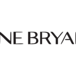
- The logo is composed of a wordmark in all capital letters.
- The pointed tops on two letters “N” make the whole nameplate look strong and unique.
- The brand’s signifier, which is also used as a website icon, is composed of two capital letters, “LB”, which are connected to each other, yet there is a small vertical white line on the bottom of the letter “B”, showing where the elongated tail of “L” ends.
- The Lane Bryant logo is minimalist yet powerful.










Leave a Review