Angry Birds logo and symbol, meaning, history, PNG
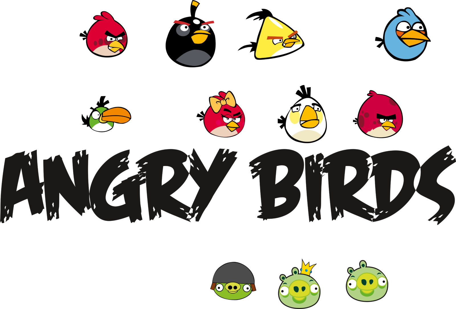
- Angry Birds Logo PNG Angry Birds is a popular video game produced in 2009 by Rovio Entertainment Limited, Finland.
- The Angry Birds logo was created by John Roshell, a comic-book graphic designer renowned for his contribution to Spiderman, Daredevil, X-Men, etc.
- The logo is notably colorful, as it combines yellow, gray, white, brown, black, and red.
- This daring color palette expresses joy, vigor, energy, fun, and excitement of the game.
- 2009 – 2010 The very first Angry Birds logo was created in 2009 and only stayed for several months.
- It was not very far from the insignia the whole world knows today, although the black and white color palette of the custom inscription was accompanied by yellow contouring, and the bold graffiti-style wordmark had its letters smooth and their angles rounded.
- The letters also had a wood pattern closer to the edges.
- 2010 – 2020 The redesign of 2010 cleaned the contours of the inscription and simplified the color palette to just black and white, removing the yellow from the official tricolor.
- The letters got more details and strolled to their surfaces, and the contours became more complicated.
- The overall mood of the logo was playful and young, like fresh air in the industry.
- 2015 – Today The logo, used by the Rovio most famous video game today was created in 2015 and has been in use as the secondary version for more than five years.
- It has cleaner and simpler shapes and contours, stricter lines, and more distinct corners compared to the two previous badges.
- The letters of the logotype are connected to each other and placed slightly jumping above the line, adding playfulness to the logo.
- As for the color palette, the official version is based on black and white, which looks bright and balanced on colorful background with game screenshots and bird characters of different colors.







Leave a Review